
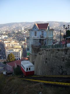
Until a few months ago, there were no signs anywhere giving directions about how to get to Cerros Concepcion y Alegre, the area of the city that attracts the most tourists. Now, along with new traffic lights on Erazurriz/Pasaje Ross there are clear signals as to how to get to the neighbourhood.

Along with this, the council initiated a scheme to change all the street signs. Now I have to say, I'm not a great fan of the new design: I really like the old style white lettering and black background especially when it's stencilled onto walls. I find the red on white a little jarring. But still...it's certainly an improvement: Now, in most of the city, you can see what street you're on. Before, you could often walk several blocks and not find any street signs and have no idea where you were.


These may seem like small developments, but they're more than that. It's proof that the council is actually starting to think about the little things that make life for locals and tourists alike just that little bit easier. The city has many grand plans, but a succession of small projects will benefit the city and its inhabitants far more.
So that's the good news. The bad news is that the city still has no idea what it's doing from a tourism point of view. Valparaiso is marketed sooooo badly. Take this poster campaign, for example: Now, I know it's not the best photo (I was driving, it was a cloudy day and I've had to zoom in and cut around the image to make it large enough) but look at it: It's so pathetically uninspiring it's laughable. The choice of photo is awful (it looks like a slum), the background colours are terrible, the font and the colour of the font are terrible...it looks like a bad school project.

Here are 4 suggestions for a better photo:


Not only this, but the new logo for the city, which cost in the region of us$20,000 to create, was dropped a couple of weeks ago before it even came into use after widespread criticism. Unsurprising, really...after all, what the hell has tango got to do with Valpo (apart from the fact that it's quite popular here)? The logo looks like a very bad kindergarten project undertaken by blind toddlers. With no hands. With epilepsy. They even forgot to put an accent/tilde on the 'i' in Valparaíso (I don't usually bother with accents because I can't be bothered to constantly change my English keyboard over to Spanish but a Chilean ad agency should be able to remember).

The same advertising agency (from Santiago, not Valparaiso) has been asked to create a new one.
6 comments:
You are seriously kidding?! That's the logo for Valpo? I'm from Texas and it looks like a cowboy hat to me. I've lived in Chile for several years now. I always credited Chilean designers for being rather gifted in their field. Now, I'm not so sure.
It was the logo but thankfully it was pulled before it came into use. Still cost us$20k though. And the council is using the same agency to do a new one. Ridiculous and maddening-a Santiaguino agency comes up with a logo that has nothing to do with Valparaiso and then they get a second attempt.
They're getting paid again as well.
So where do I get paid 20K to come up with a logo? I also noticed the new signs on Pedro Montt. I am amazed that they haven't been vandalized -since the trash cans outside my apartment frequently get bashed to pieces. My theory is that maybe everyone is too busy wondering why they look like a spaceship dropped them off to vandalize them.
If you come up with a new logo like that, I'll tell you where to go to get a punch in the face :)
I'm also surprised the signs haven't been vandalised. Maybe Chileans have a new found respect for public property. Er.
I've had Valpo on the mind ever since my one, all-too-short visit two years ago. The city struck a nerve and won me over. Interestingly enough, I always mention the lack of traditional signage as one of the characteristic charms of the place. I guess I'll have to backpedal on that one detail when urging visitors to South America to find their way to Valparaiso.
well as i said, i prefer the stencilled white on black signage but that only works if it's everywhere. the new signs are as helpful to locals as they are to tourists so they go down in my book as Good Thing.
Post a Comment